ACRE
Rationale
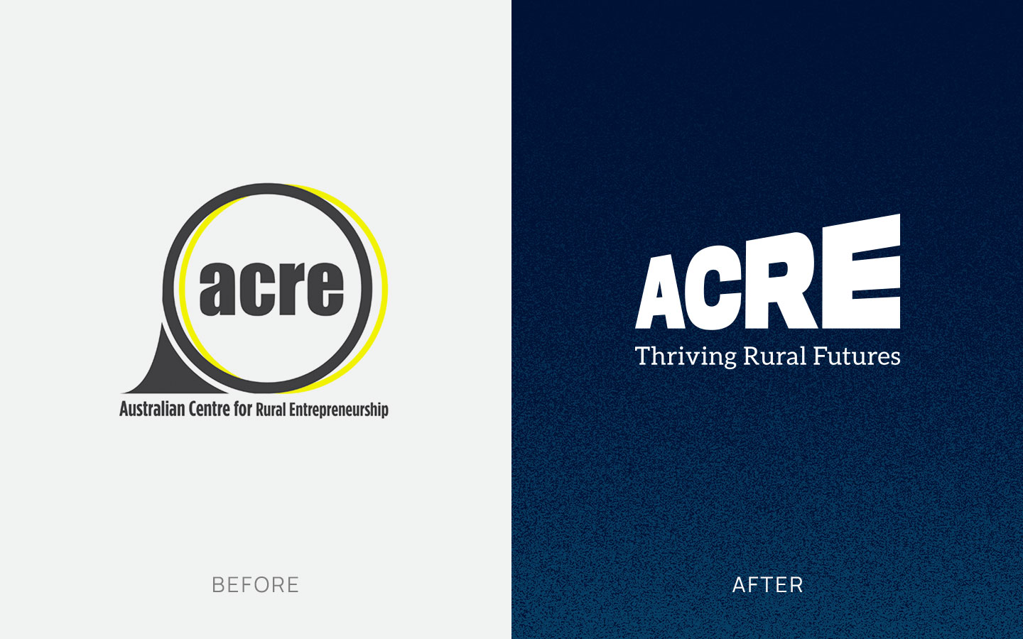
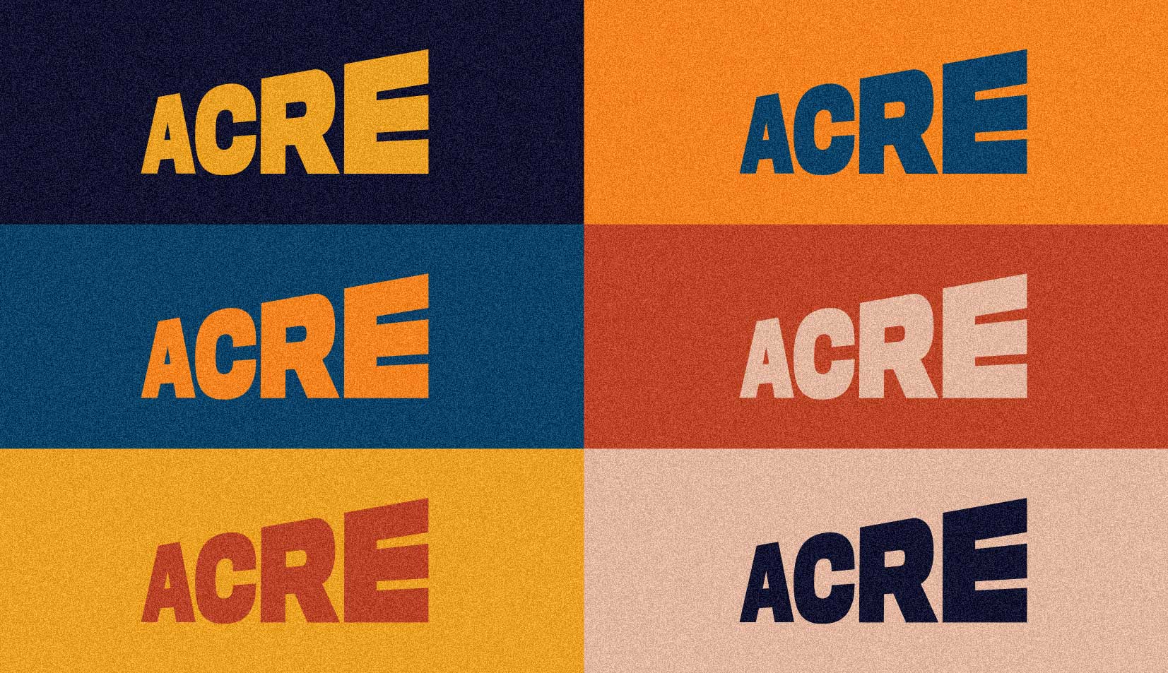
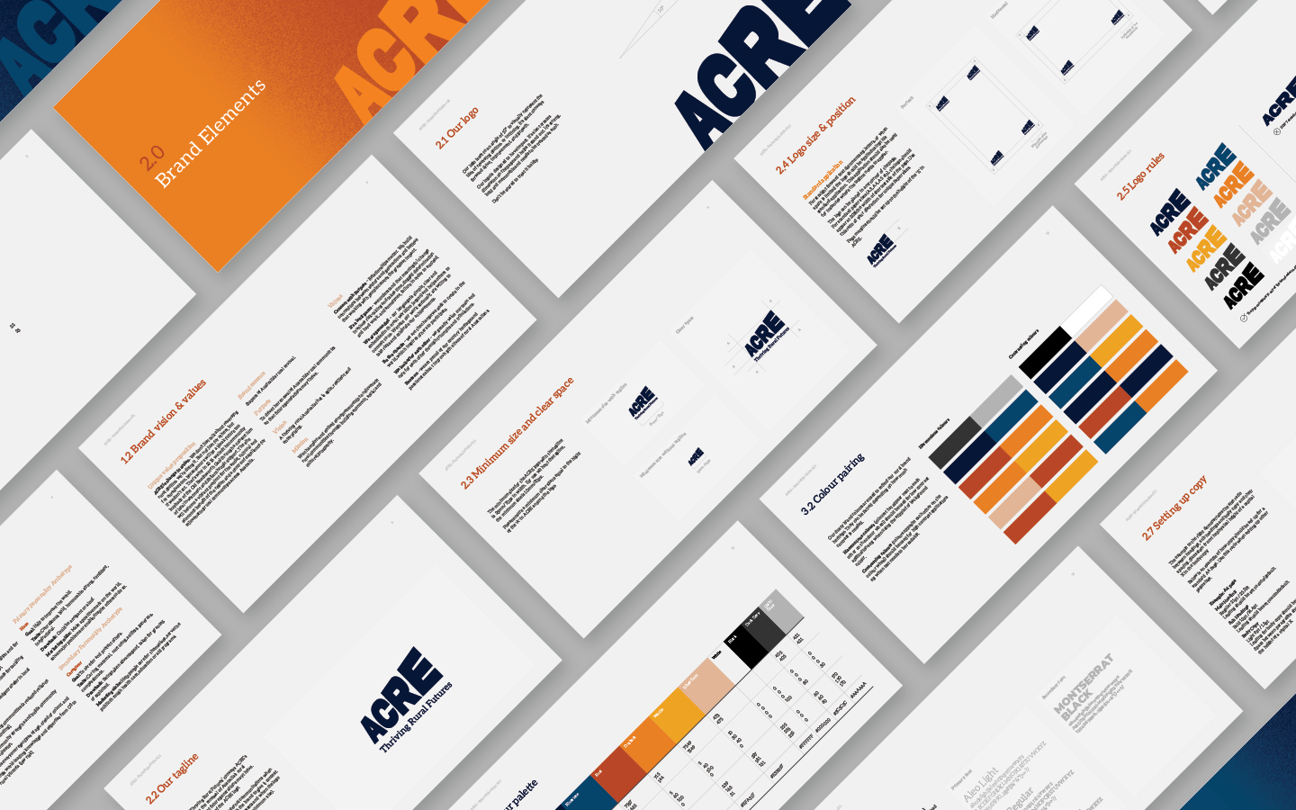
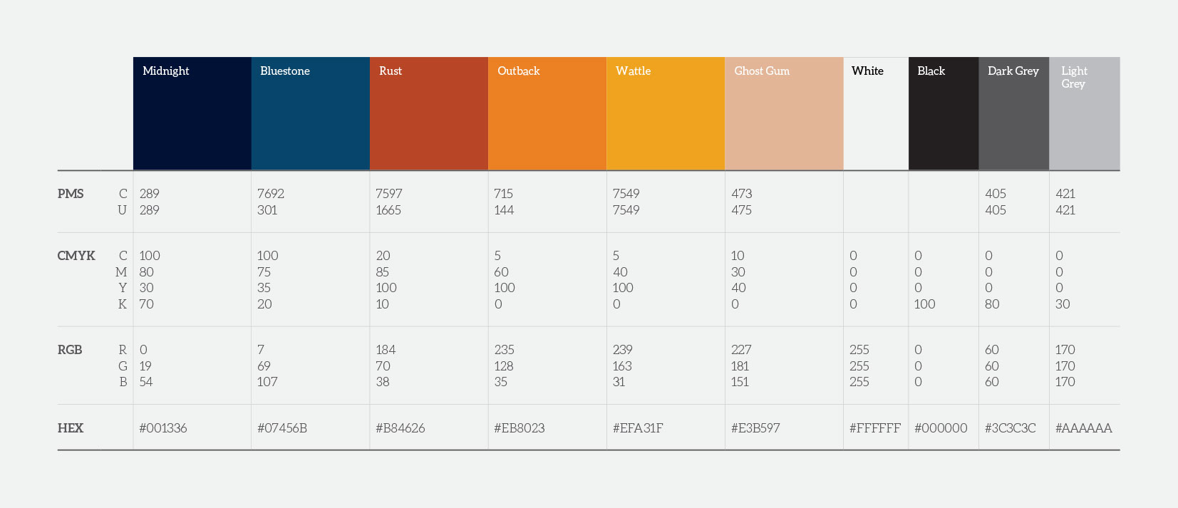
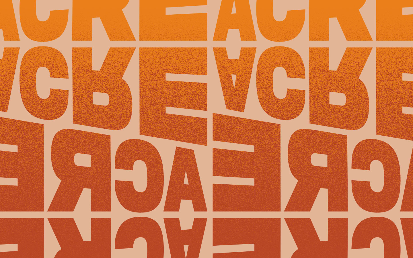
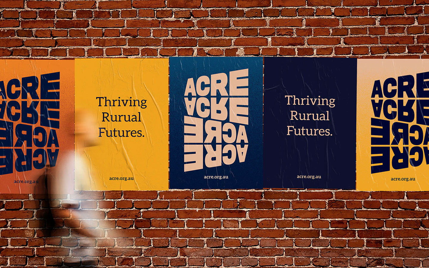
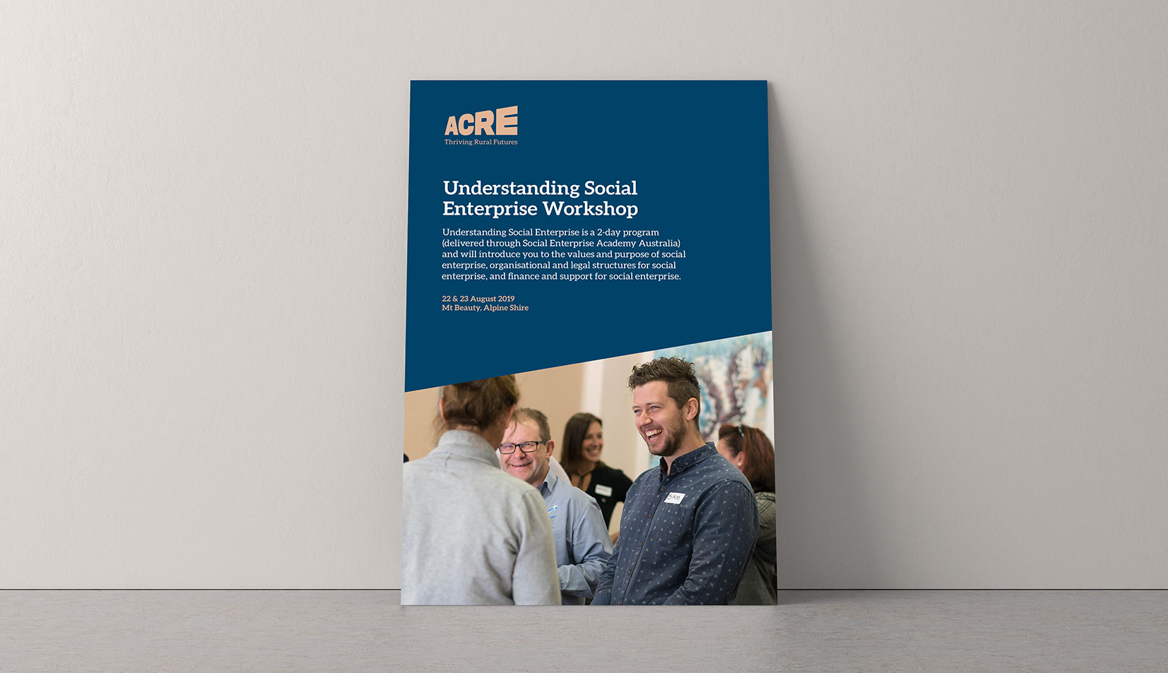
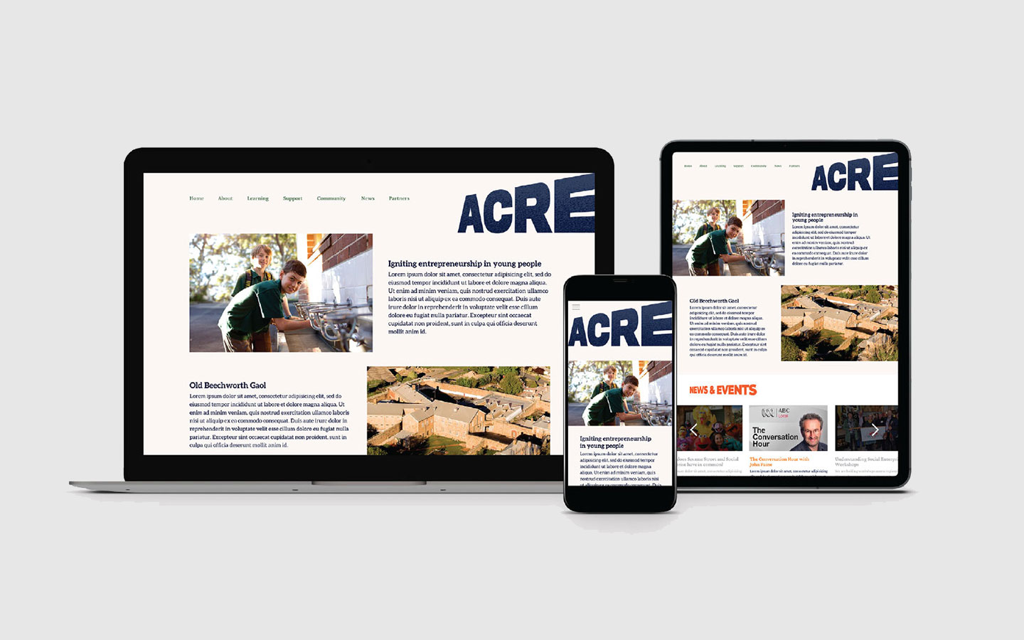
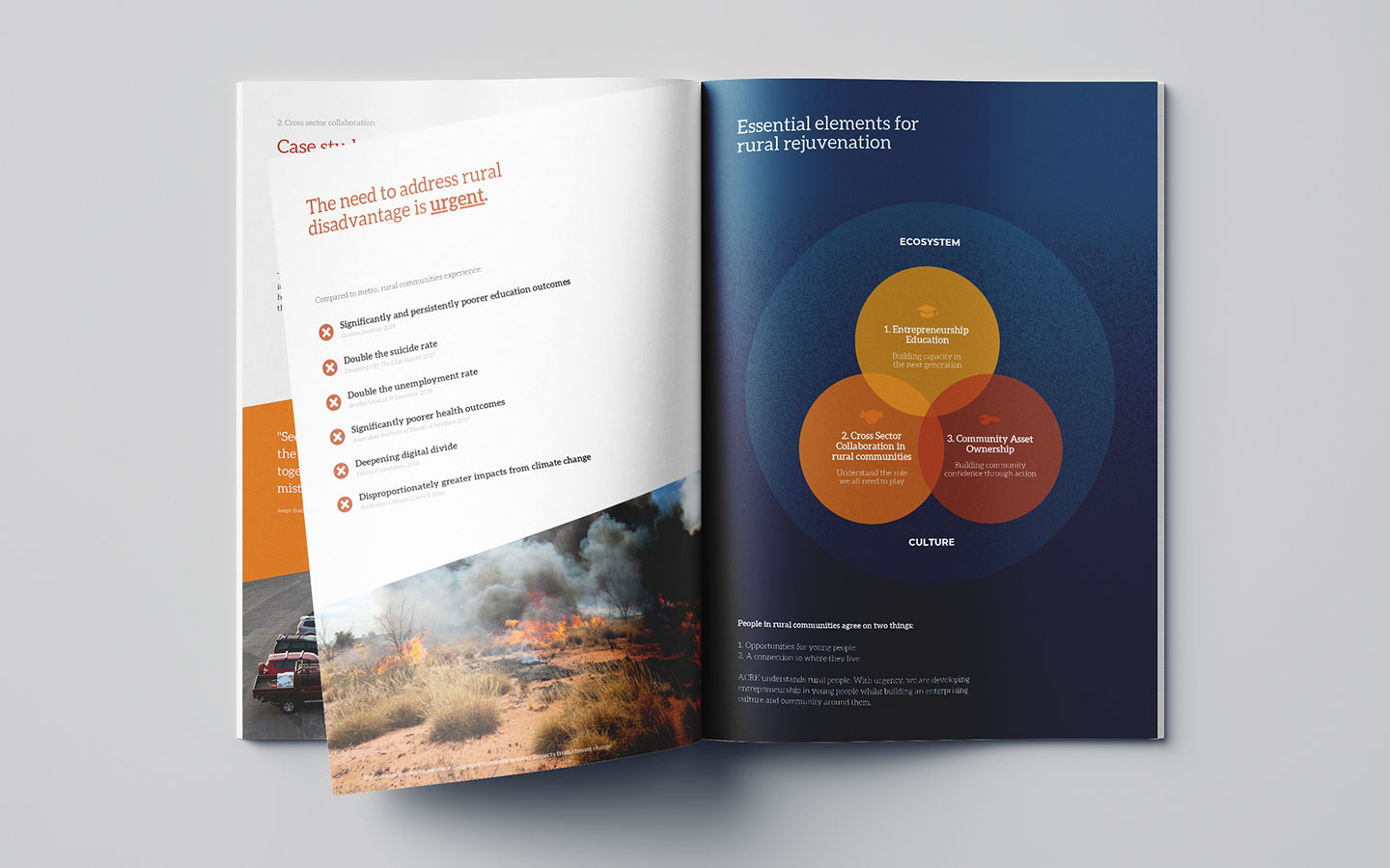
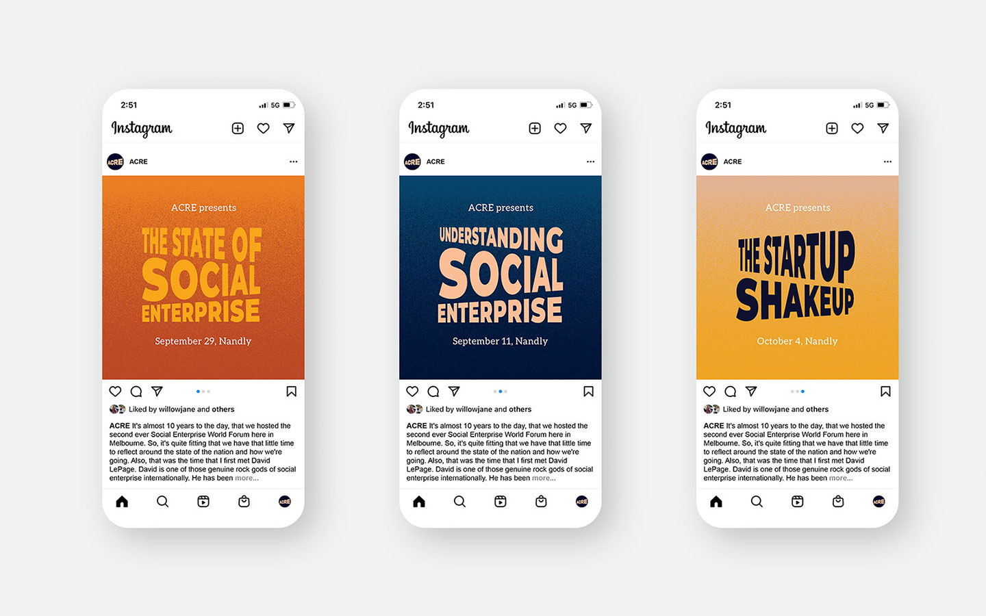
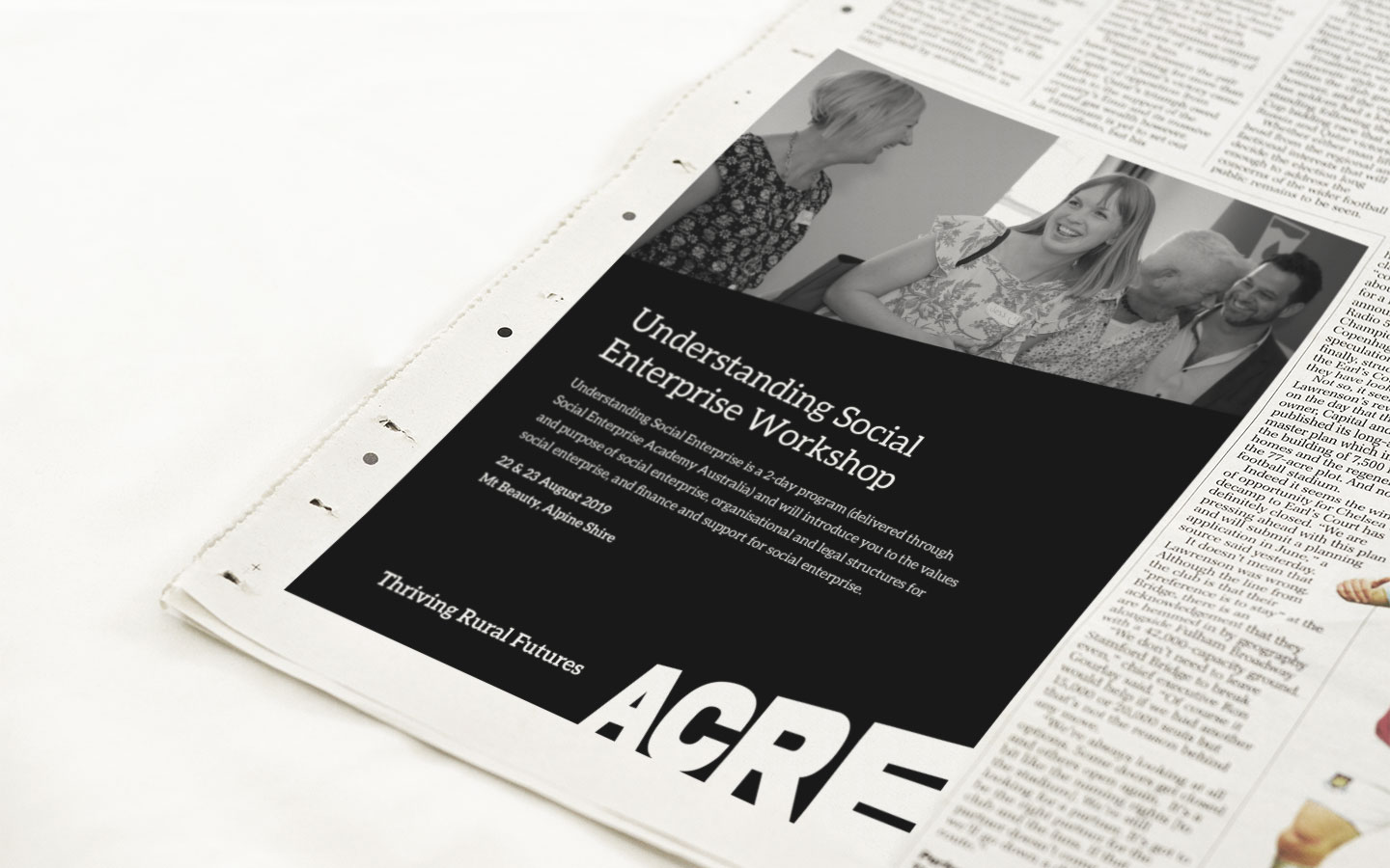
I was involved in developing a refreshed brand identity for the Australian Centre for Rural Entrepreneurship, including a portfolio strategy to bring clarity and cohesion to its numerous sub-brands. The concept behind the logo was built around ACRE’s mission to reverse rural decline, using the idea of an incline as a visual expression of positive movement, growth, and rejuvenation. The supporting visual identity drew on stipple textures and colours inspired by the Australian outback, helping connect the brand to the rural communities it serves. Together, the identity system positioned ACRE as optimistic, grounded, and future-focused, while giving the organisation a more unified and adaptable platform for communication across its programs and initiatives.