Fight Parkinsons

Rationale
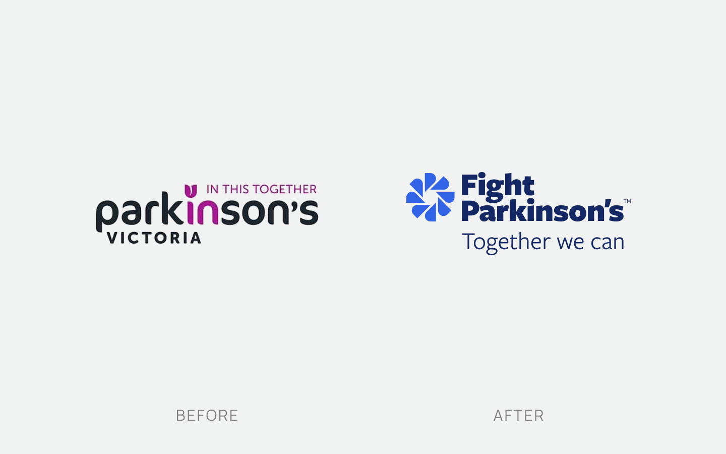
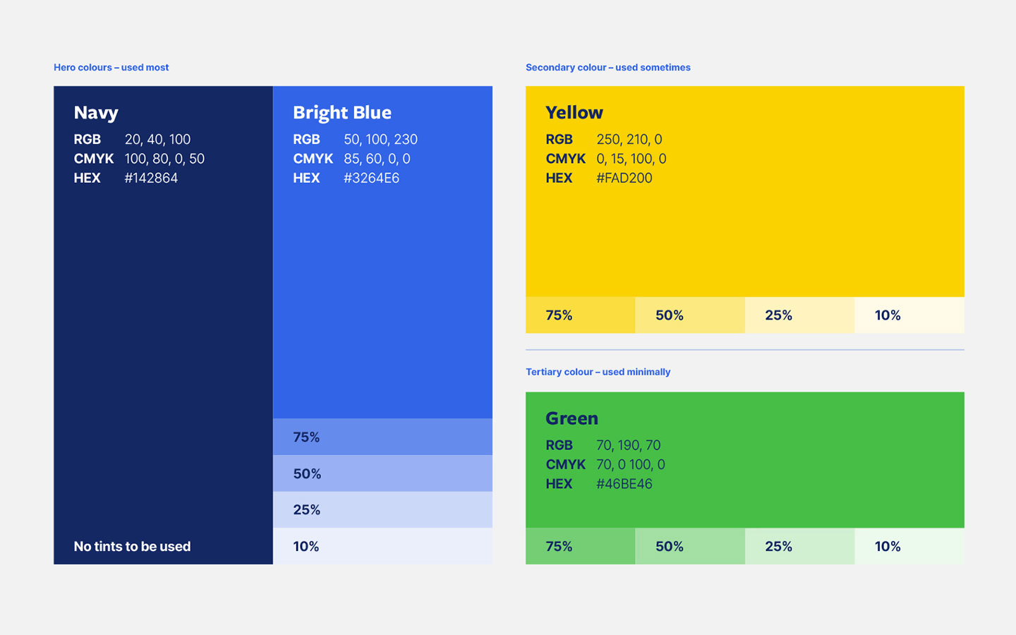
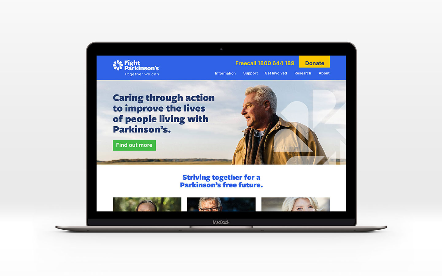
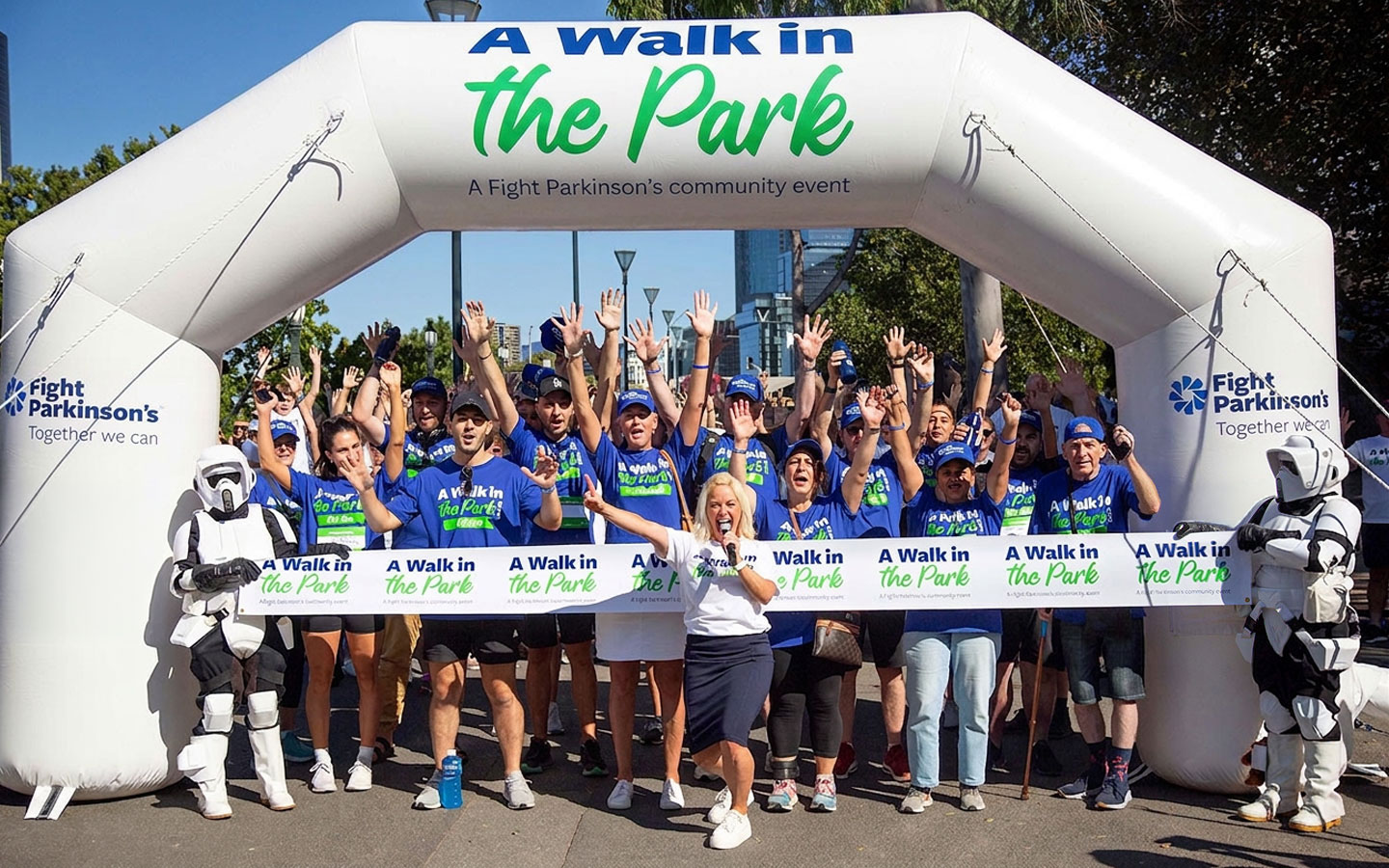
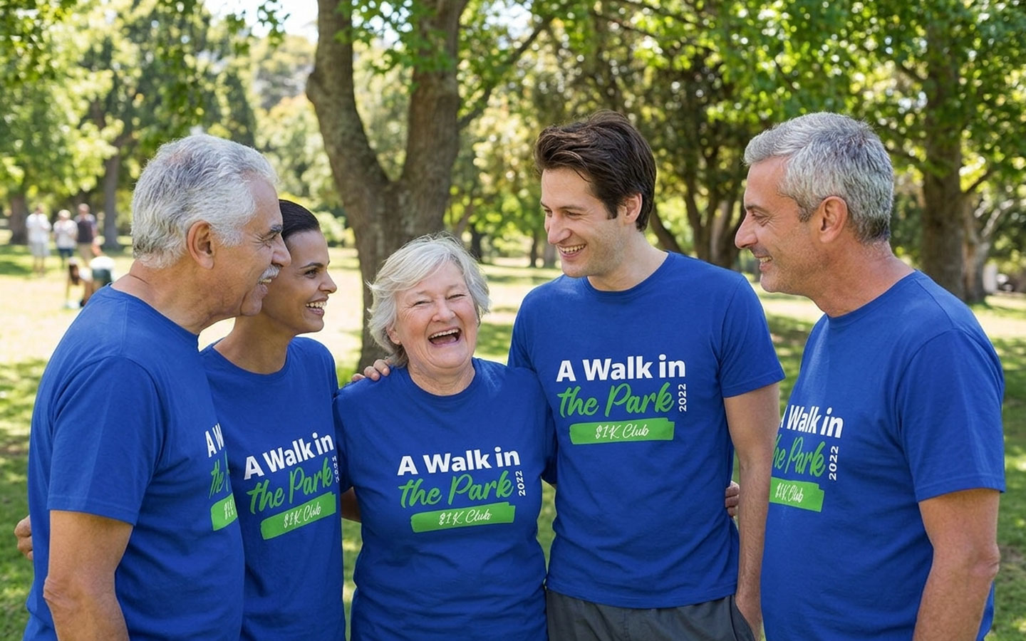
I was involved in developing the visual identity for Fight Parkinson’s following extensive brand research, strategy work, and the decision to rename the organisation from Parkinson’s Victoria. The logo was built from abstract letter “Ps”, representing the tight-knit Parkinson’s community and the way the organisation brings individuals with different stories, needs, and experiences together under one supportive network. The brand device also reflects the interconnectivity of the services, care, and advocacy provided by Fight Parkinson’s, with a sense of movement and energy that speaks to progress, possibility, and collective action. A bright blue was used to project optimism and hope, while the navy wordmark added professionalism, credibility, and authority, helping position Fight Parkinson’s as both compassionate and expert.